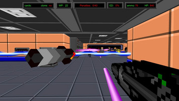
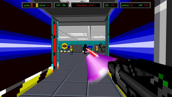
HUD overhaul


People were pointing out a pretty big oversight from us: the HUD was too spartan and uninformative, and also it was not always clear when objects were interactable.
So, we changed the HUD to display your penalty/worthy points and your level of Entanglement Deterioration (which is your de facto lives number).
Also, we made the reticle change color to green when the player points at a searchable object. I’m particularly proud of this one, because I never liked when a game shows that little “e” popup every time you look at something interactable. I find it weird to keep seeing the “e” next to a door even after playing for, say, 40 hours. So I think our solution is quite elegant and effective, just like my sex appeal when it comes to turn girls off.
Files
Red Laser Z
Retro arcade FPS
More posts
- An Update on the State of ThingsApr 06, 2020
- Very smol updateDec 03, 2018
- New stuff, finallyNov 30, 2018
- Upcoming new Blue LaserJul 27, 2018
- New levels!Dec 10, 2017
- Small update to fix stuffAug 28, 2017
- New checkpoint system!Aug 25, 2017
- Bug fix for Windows 10 "smartscreen"Jul 17, 2017
- Red Laser Z UpdateJul 13, 2017

Leave a comment
Log in with itch.io to leave a comment.